


ButtonsFactory
Factory class for creation of several kind of buttons. The following CSS is required:
<!-- API CSS -->
                        <link rel="stylesheet" type="text/css" href="https://api.geodab.eu/docs/assets/css/giapi.css" />
Item Index
Methods
- caleButton static
- onOffSwitchButton static
- roundCornerButton static
Methods
caleButton
-
label -
[options]
Nice button based on http://www.cssbutton.me/calebogden/4fd7c9f23f2df02715000000.
For additional personalization, see the calebogden-button class of the giapi.css file
Parameters:
-
labelString -
[options]Object optional-
[id]String optionalbutton identifier
-
[handler]Function optionalbutton click handler
-
[color="green"]String optionalavailable colors are:
- 'green' 
- 'blue' 
- 'yellow' 
- 'red' 
-
[title]String optional -
[attr]Object[] optionalarray of attributes defined by objects like this
{'name':'attribute-name', 'value':'attribute-value'}to be added to the button. They can be used to store particular values to use in the 'click' function. E.g.:jQuery("#"+id).click(function(){ var attrValue = jQuery(this).attr('attribute-name'); .. });
-
Returns:
the button HTML markup
onOffSwitchButton
-
onLabel -
offLabel -
[options]
On/off switch button based on https://proto.io/freebies/onoff/.
Example with all the options set to the default values:
                                            GIAPI.ButtonsFactory.onOffSwitchButton('On label','Off label', {
                                            'borderColor':'rgba(55, 141, 229, 0.47)',
                                            'shadowColor':'#999',
                                            'onColor':'#323232',
                                            'offColor':'#999999',
                                            'onBckColor':'rgba(255, 255, 255, 1)',
                                            'offBckColor':'#EEEEEE'
                                            'switchColor':'rgba(121, 187, 255, 0.24)',
                                            'switchBorderColor':'rgba(55, 141, 229, 0.47)'
                                            }
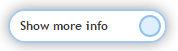
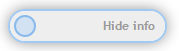
For additional personalization, see the onoffswitch class of the giapi.css file
Parameters:
-
onLabelString -
offLabelString -
[options]Object optional-
[size]Object optional -
[checked=true]Object optional -
[id]String optionalbutton identifier
-
[handler]Function optionalbutton click handler
-
[shadowColor="transparent"]String optional -
[borderColor="transparent"]String optional -
[onColor="white"]String optional -
[offColor="#white"]String optional -
[onBckColor="#467FC9"]String optional -
[offBckColor="#2c3e50"]String optional -
[switchColor="white"]String optional -
[switchBorderColor="white"]String optional -
[attr]Object[] optionalarray of attributes defined by objects like this
{'name':'attribute-name', 'value':'attribute-value'}to be added to the button. They can be used to store particular values to use in the 'click' function. E.g.:jQuery("#"+id).click(function(){ var attrValue = jQuery(this).attr('attribute-name'); .. });
-
Returns:
the button HTML markup
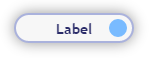
roundCornerButton
-
label -
[options]
Rounded corner button with CSS round icon based on https://proto.io/freebies/onoff/.
Example with all the options set to the default values:
                                            GIAPI.ButtonsFactory.roundCornerButton('Label',{
                                            'enabled':true,
                                            'iconRadius': 20,
                                            'borderRadius': 20,
                                            'width':120,
                                            'labelColor':'rgb(43, 44, 105)',
                                            'bckColor':'#F7F7F7',
                                            'hoverBckColor':'rgb(187, 218, 247)',
                                            'borderColor':'rgba(63, 81, 181, 0.42)',
                                            'iconX':95,
                                            'iconColor':'#79bbff',
                                            'iconBorderColor':'#79bbff',
                                            'shadowColor':'#999'}
                                            );
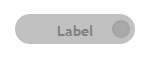
Example with darker colors and less rounded corners:
                                            GIAPI.ButtonsFactory.roundCornerButton('Label',{
                                            'labelColor':'#2C3E50',
                                            'borderRadius':8,
                                            'borderColor':'rgba(44, 62, 80, 0.62)',
                                            'iconColor':'#2C3E50'}
                                            );
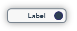
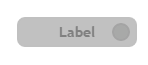
For additional personalization, see the rounded-corner-button class of the giapi.css file
Parameters:
-
labelString -
[options]Object optional-
[id]String optionalbutton identifier
-
[handler]Function optionalbutton click handler
-
[enabled=true]Boolean optional -
[width=120]Integer optional -
[labelColor="rgb(43, 44, 105)"]String optional -
[bckColor="#F7F7F7"]String optional -
[hoverBckColor="rgb(187, 218, 247)"]String optional -
[borderRadius=20]Integer optional -
[borderColor="rgba(63, 81, 181, 0.42)"]String optional -
[iconX=95]Integer optional -
[iconRadius=20]Integer optional -
[iconColor="rgb(43, 44, 105)"]String optional -
[iconBorderColor="rgb(43, 44, 105)"]String optional -
[shadowColor="#999"]String optional -
[attr]Object[] optionalarray of attributes defined by objects like this
{'name':'attribute-name', 'value':'attribute-value'}to be added to the button. They can be used to store particular values to use in the 'click' function. E.g.:jQuery("#"+id).click(function(){ var attrValue = jQuery(this).attr('attribute-name'); .. });
-
Returns:
the button HTML markup